Tile Giant’s iDesign Tile Visualiser Review
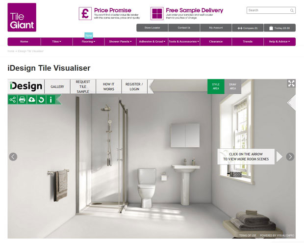
Tile Giant’s iDesign Tile Visualiser Review
We’re in the middle of planning our bathroom renovation and the walls and the tiles that go on them are a big part of any bathroom. There are so many different styles and types to choose from. Then there are the potential borders, grout colours, tile patterns and potential colours for any walls without tiles. Plus the floor!
There are many decisions that need to be made and it can feel quite overwhelming. A while ago, when we first started planning our bathroom properly, we went on a trip to Leeds and visited some bathroom and tile shops and one of them was Tile Giant. We found some nice tiles and got the inspiration we needed for the time. Just when we were about to go home, a friendly shop assistant stopped us and asked if he could show us their new design tool. We said yes and we are so glad we did.
Tile Giant’s iDesign Tile Visualiser lets you play around with the design of your bathroom or kitchen, try different tiles and patterns, colours and combinations. You can add borders and tile different areas in different ways and try different floors — pretty much whatever you want.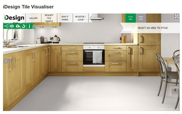
You start by choosing a kitchen or a bathroom design that is the most similar to your room or whichever style you are planning to have in your new kitchen or bathroom. You can also browse finished designs for inspiration.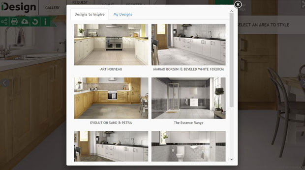
I went for the smallest and most simple bathroom since we are working with a tiny room here at home and it was the most similar to ours. You click on a wall or the floor to change it and choose to paint it, to tile it or to put down wooden or laminate flooring. If you choose tiles then you can play around with different tile patterns. This can quickly change the look of the room and has so much impact on the overall design. There are six different options to choose from. 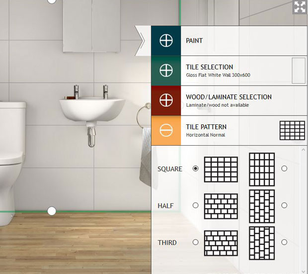
When visiting Tile Giant, we had an idea to have rather large white tiles and a red subway tile border. We hadn’t even thought about the fact that you can change the tile pattern until the shop assistant showed us.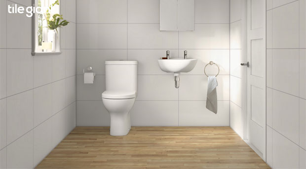
I recommend having a look through the tiles on the website before using the design tool to find a few tiles that you are interested in. You can then search for those exact tiles within the tool and add them to your walls. The tiles we want are something like the Gloss Flat White ones from Tile Giant (either in 300x600mm or 250mmx400mm) and the overall effect is so different depending on if you line them up or offset them. The lined up version (above) looks calmer and more peaceful but the offset one (below) has that subway look that we like and is a bit easier to do well if you’re tiling yourself.
The fact that you can play around with grout colours has been so helpful for us. We really want grey or dark grey grout because we think it looks really nice with white tiles. When I tried the smaller tiles with a red boarder of subway tiles, I noticed that the red subway tiles really don’t work with the grey grout. In the image below, I have applied white grout to the red tiles and they look lovely like that, but having two different types of grout is not really doable in real life. So the iDesign Tile Visualiser helped us realise that the red border is not a good choice if we really want grey grout.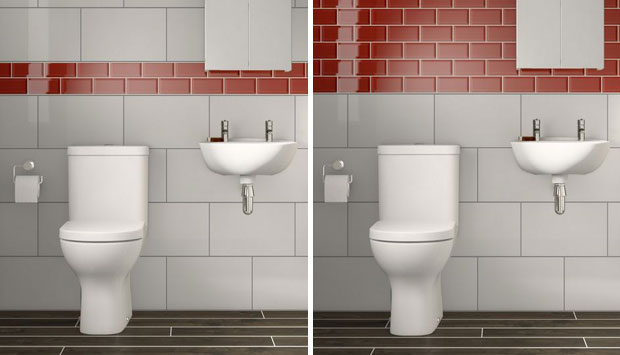
After trying a few different design and styles, I think I prefer the cleaner look of no border and just white, large tiles together with an oak style laminate floor, like the one further up in this post, Cappuccino Oak 12mm Laminate Flooring. It looks fresh, light and more spacious and I can add pops of colour with towels, bath mats and other details.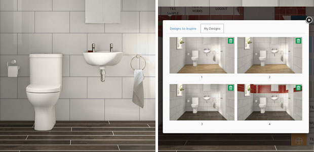
When you’re playing around with you designs there are two options given for each element — Style Area and Draw Area. Use Style Area if you want a full wall or the majority of the wall the same and use Draw Area for details such as splash guards and borders. You can then use the Draw function on top of already styled areas like I have done here (below, top left image). You can use Style Area too but if you change your mind about something it seems to be quite difficult to change it. You can pull the white circles to change the size but when I wanted to change it back I could not pull it all the way back up to the top of the wall (see image below, top right and bottom). When you use the Draw Area function you get a bin symbol in the corner that makes it really easy to delete something if you’re not happy. So full walls need the Style Area function and details need the Draw Area function. If you remember that, then it’s really easy to play around with different looks and borders. 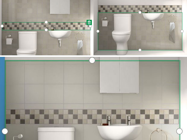
I recommend creating an account with Tile Giant because that lets you save your different designs in your own private gallery so that you can go back and have a look at your different creations to see which ones you like the best. You can easily print your designs too if you want to show other people and you can even share them on Facebook, Twitter and Pinterest.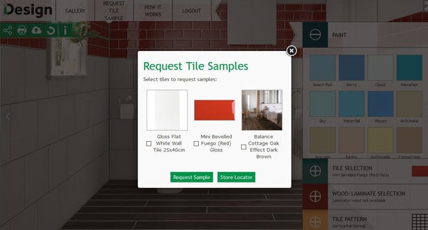
The “i” symbol lets you see all the products that you have used in your current design and so does the Request Tile Sample button. You can quickly tick the boxes for which products you’d like samples and easily locate a store near you.
Tile Giant’s iDesign Tile Visualiser is a brilliant tool that has helped us loads when it comes to planning the walls of our bathroom. The only way I could think to make it better is if you could draw up your own bathroom and add different suites and bathroom accessories for a full bathroom plan. Tile Giant is a tile shop though and doesn’t sell these products but maybe, in the future, there could be a collaboration with a bathroom shop that focuses on the other details for a tool that lets you plan your whole bathroom from tiles and floors to bathtubs and taps.
Try out the iDesign Tile Visualiser here!
I was asked to test out this tool at home and share my experience. As always, all my reviews are 100% honest and all thoughts and opinions are my own.


