
The Fascinating Ways Different Colours in Interior Design Affect Mood
The Fascinating Ways Different Colours in Interior Design Affect Mood
Colour is an important part of life and plays a huge part in interior design too. Choosing the right colours for a space is a fundamental part of creating a design that not only has a cohesive, stylish look but also inspires the activities that the room is intended to be used for. Of course, personality and personal preference is another aspect that is important to consider too. It’s become clear that colours in interior design affect mood which is the topic we’ll explore in this article.
Colour psychology is the theory of how different colours affect us human beings – our mood, feelings, productivity, creativity and so on. This is why it’s so important to consider what a room will be used for before choosing a colour scheme.
It is clear that there are scientific effects of different colours and hues on our brains. While there are many effects that seem similar for most of us, we are all individuals with different tastes and connections to different colours too, of course, which is why it’s important to talk this through if you’re choosing interior design colours for someone else.
How Colours in Interior Design Affect Mood
Let’s look at how different colours in interior design affect mood and what kind of effect they generally have on people. It’s quite fascinating!
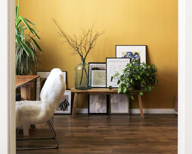
Yellow
Let’s start with the happiest of all colours, the colour of light and sunshine – yellow! Bright yellow colours in interior design is a great way to make a room feel sunny and warm. This in turn makes people feel happy and optimistic. Yellow works especially well in kitchens and dining rooms and also in smaller spaces like bathrooms or hallways. Don’t go overboard with all yellow though as that can be too intense. Instead, combine it with other colours to get the best result. Yellow works really well for adding pops of colour to rooms with darker, natural hues or in rooms with a white and grey colour scheme for a sophisticated look.
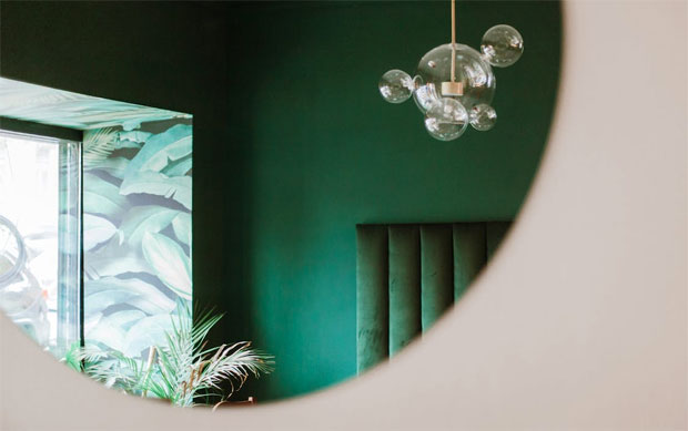
Green
Green is a wonderful colour that we generally associate with nature, peace, harmony and trust. Lighter shades of green and olive green have a calming effect. These green shades can be used throughout the home. Natural green hues are a great way to bring a bit of nature into your home. These look great combined with lots of plants and wooden furniture. We recently painted a feature wall in our bedroom a stunning green and I love how that’s changed the room and instantly made it feel like a serene place.
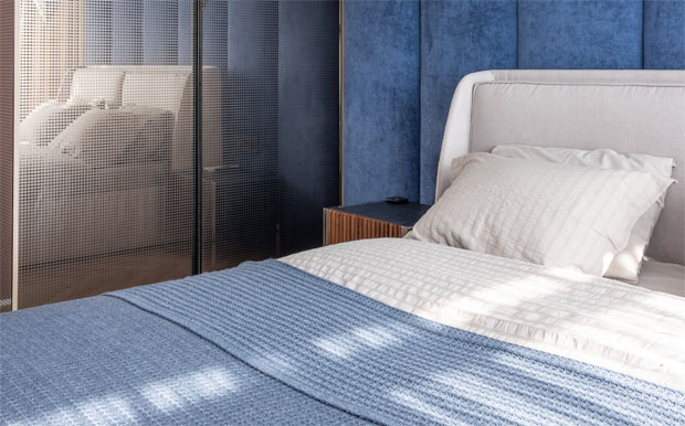
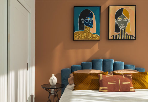
Blue
Another calming and relaxing colour to use in interior design is blue. Blue is a powerful colour with lots of positive effects and no common negative connotations. Blue is a soothing colour, so much that it even slows down our heart rates, blood pressure and metabolism. It’s a great colour to use in bedrooms for this reason and in any other spaces intended for relaxing. Shades like sky blue and aqua blue are particularly healing as it reminds us of being near the sea or on holiday next to a swimming pool.
Darker blues like royal blue in different shades are great for more active rooms. You can combine them with crisp white or dark wood to create a luxurious, classic and sophisticated space or with other brighter colours for a playful environment. Different shades of blues look great together too. Very dark blue looks amazing as a feature wall in smaller spaces like a small bathroom combined with white for contrast.
Red
Red is a very vibrant colour that has several meanings. On one hand it’s the colour of love but it’s also the colour of anger. Therefore, the use of red in interior design needs to be carefully planned to achieve the desired effect. Combine red with neutral colours for balance and, when using it on walls, consider a feature wall to not overwhelm the room.
Since red is such a lively and energising colour, it’s a great colour to use in office environments. Since it’s also a colour of love and friendship, it works well in social spaces like the living room or in the bedroom if you’re looking to make that room a more passionate place.
Orange
Orange is another vibrant colour with positive effects on our brains. The colour orange symbolises success, sunshine and nature and is a happy colour for most of us. You can use orange in both calm spaces like bedrooms and in more energetic rooms like an office or gym to stimulate people, depending on what colours you use as complements. Orange works especially well with teal, crisp white, grey, and dark brown.
Purple
Purple is an elegant colour that works great in rooms where you want to inspire creativity like a home office, studio or walk-in closet. Bold shades are especially suitable for this while lighter shades like lavender create a sense of calm.
Pink
The colour pink is an emotional colour that represents love, compassion, comfort, cleanliness, and feminism. You can use pink in more discreet shades for a sophisticated look or in bold, rich shades like magenta to make a statement. Combine with natural colours, other vibrant, warm colours like red and orange or simply with white. Great for children’s bedrooms or a teen room, but also to create a glamorous bathroom or a joyful living room.
Brown
Brown is a safe, natural, sophisticated colour but best used in furniture rather than the walls. It can of course be used on walls too, but then it’s best used sparingly as a feature wall as too much brown can lead to inactivity as it relaxes people a bit too much. Combine a brown wall with white and bright pops of colour like yellow, blue, or orange.
Of course you can also add colour to your home without painting the walls. Dark brown wooden furniture and dark leather sofas or chairs are great for when you want to add feelings of power and strength – great for some office environments when you want to impress or for a classy home library.
Grey
Grey is a great neutral colour that is suitable for many rooms of the home. It’s generally associated with elegance though some people find it boring, There are so many different shades of grey to choose from to suit the space you’re working with. You can use grey on walls, textiles, carpets and furniture and this colour generally instils feelings of calm and style. Combine grey with happy and bright colours like yellow or pink or with neutrals like brown and white depending on the feel you’re going for. Grey also works well with otherwise monochrome environments. Grey walls look best in rooms with plenty of natural light to make sure it doesn’t turn into a depressing colour.
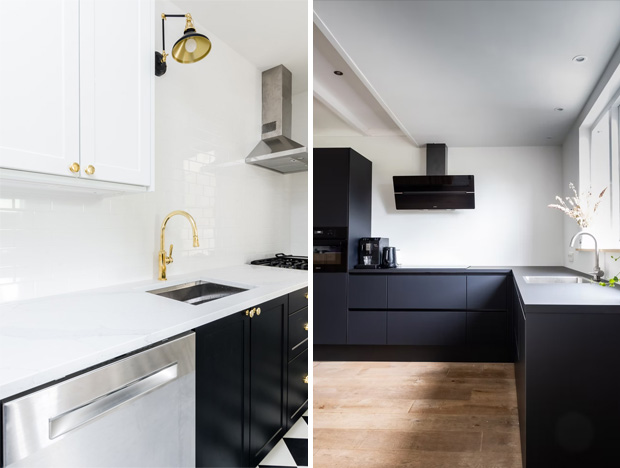
Black
Black is a bold and elegant colour that works well in modern interior design. An all-black room would be overwhelming but black adds a superb contrast when balanced well with other colours. The colour black can be used in many areas of the home to make a space feel functional and sophisticated. Likewise, black details are especially great for simplistic and minimalist interior design. Black looks great with white and metals like gold, silver or brass.
White
Last but not least, white. White is the most important colour in interior design and in design in general. The blank, white spaces are so important to the overall look. White is a neutraliser and a blank canvas for the rest of your design ideas but also a colour of its own.
White represents peace, tranquillity and cleanliness which is great for all rooms in a home. In more minimal interior design styles such as Scandinavian interiors and Japanese design, there is always plenty of white, usually combined with other neutral colours and natural materials which creates an ideal environment for simple living. You can also successfully combine white with pretty much any other colour. Naturally, using white on your walls will make your space look and feel bigger which is always a good thing.
Another variation of the colour white, is also cream which can exude the same calming and peaceful effects. It’s important to make the most of the colour cream throughout your home as it can break up any stronger colours, and it also provides a more muted option compared to white. For example, you may want to add a cream rug to your living room to help create the illusion of space and luxury. There are so many different ways to make the most of white and cream shades when refining your interior décor.
Conclusion – Colours in Interior Design Affect Mood
As you can see, different colours in interior design affect mood in various ways. Because of this, it’s important to consider your colour choices carefully to get the desired feel in your home.
Collaboration.
Related Posts


About The Author
A Mum Reviews
This blog is edited by a mid-30s mum with over 15 years of professional childcare experience. Now 10 years into motherhood and enthusiastic about finding great products and helpful solutions for busy families to make life more fun and easier too.
This blog has inspired me to rethink the color scheme of my living room. I had no idea that colors like yellow can actually boost energy and happiness. Thanks for sharing the knowledge.